i went to the
moma and...
UX/UI Designer
Webby's People's Choice Awards, 2012
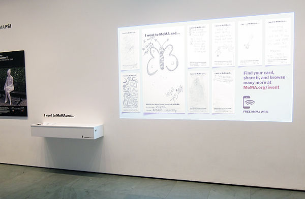
When the Museum of Modern Art asked us to build an interactive experience for their 'I went to MoMA and...", we thought about making the experience of drawing, scanning and seeing it upload to the web seem effortless. After many prototypes of both the physical space and website, the most minimal and elegant one came through.

CHALLENGE
POKE created an automated scanning station that was easy for the visitors to comprehend and operate. My design challenge was to connect those scanned cards to the virtual social space in an elegant way. The automated CMS had to also include a system to be reviewed and potentially be manually flagged before they were published on the site.
As the cards grew every day, we needed to implement a simple method to have users easily navigate and skim through the cards based on interests, emotions, or activities.
SOLUTION
The solution was a bit ahead of its' time. It was 2012 and there weren't many sites catering to mobile . The cards were displayed in long feed, and could be filtered at the very top.
Different tags describing the drawing could be added both from the uploader and through the CMS.

TAKEAWAYS
-
UX/UI Lead for the online experience
-
Integrating interactive experiences into physical spaces

Materials provided at the museum to fill out cards, each card came with a unique URL

Museum Visitors would be invited to draw and scan their cards through the scanning station. Cards were shown somewhat in real time

Video provided by Makeable (Formerly known as POKE New York)